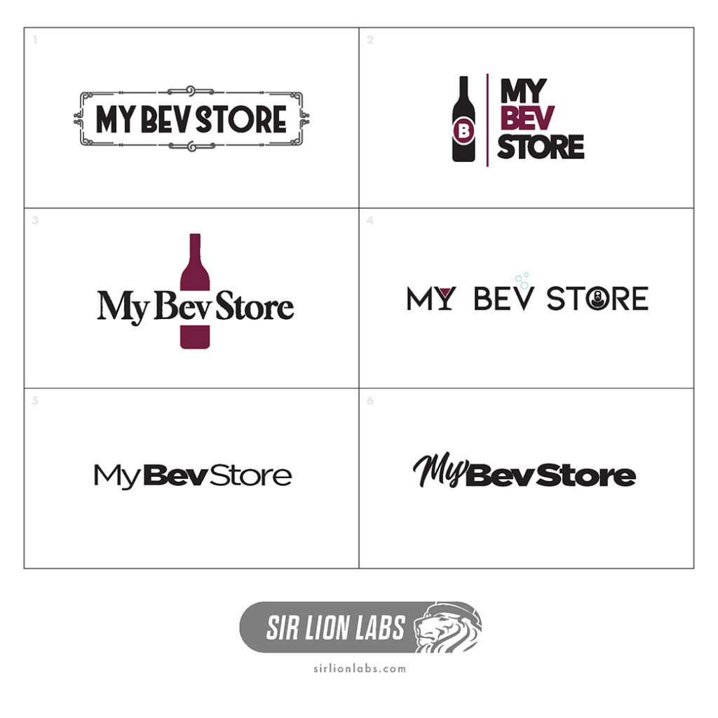
A simple design to get the message across: My Bev Store. Starting out with a few typefaces to establish a base for the branding. Some concepts using a serif font can convey a rustic aesthetic like an old winery or using a sans-serif font for a look that’s a bit more sharp and modern. Combine this with some subtle complementary elements to individualize the logo design into something unique.
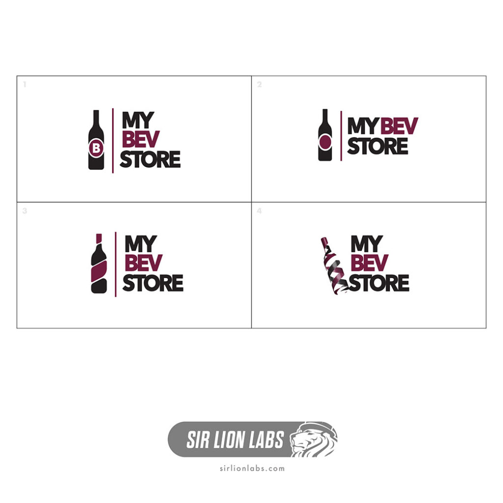
From the concepts, the client decided on one of the first ideas we had in mind. In an effort to refine the simple concepts a bit further, we decided to explore some variations on the bottle design utilizing new shapes, styles, and effects but in the end, we hit the mark for the client the first round.


 Prime Wheels Logo