Establishing a brand is more than choosing a clever logo. The overall art-direction is an important step to consider so that the aesthetic represents the message your brand is trying to convey.
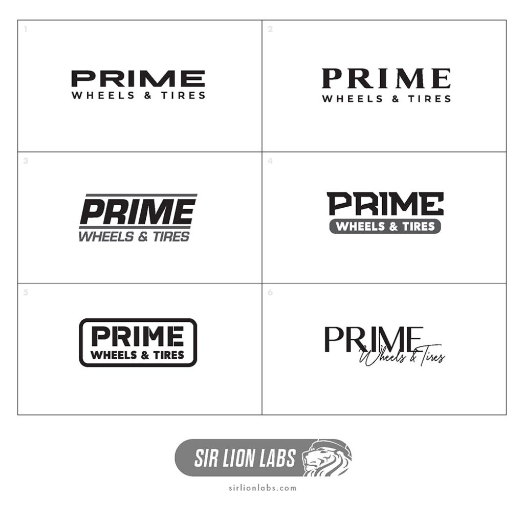
Let’s take a look at some of the initial concepts for Prime Wheels where we’ve narrowed down to two initial typefaces but each one has a slightly different approach to the parts of the design that make up the whole. In the design world we call that “gestalt”.
gestalt noun
: something that is made of many parts and yet is somehow more than or different from the combination of its parts
When he gets rolling, you’re not responding to single jokes—it’s the whole gestalt of the movie that’s funny.
[https://www.merriam-webster.com/dictionary/gestalt]
Starting with the basics in black & white and simple text to establish the fundamental elements. Even a simple typeface– serif or sans-serif can make a huge statement about a brand. Serif type suggests more high-end whereas the stenciled look of #5 appears more rugged and military-like. From there we can add a few complementary elements to alter or push that message a little further. At this point, the exact design and color palette is not important but these simple rough concepts helps filter out the bad ideas so we can focus attention on the designs with the most impact.
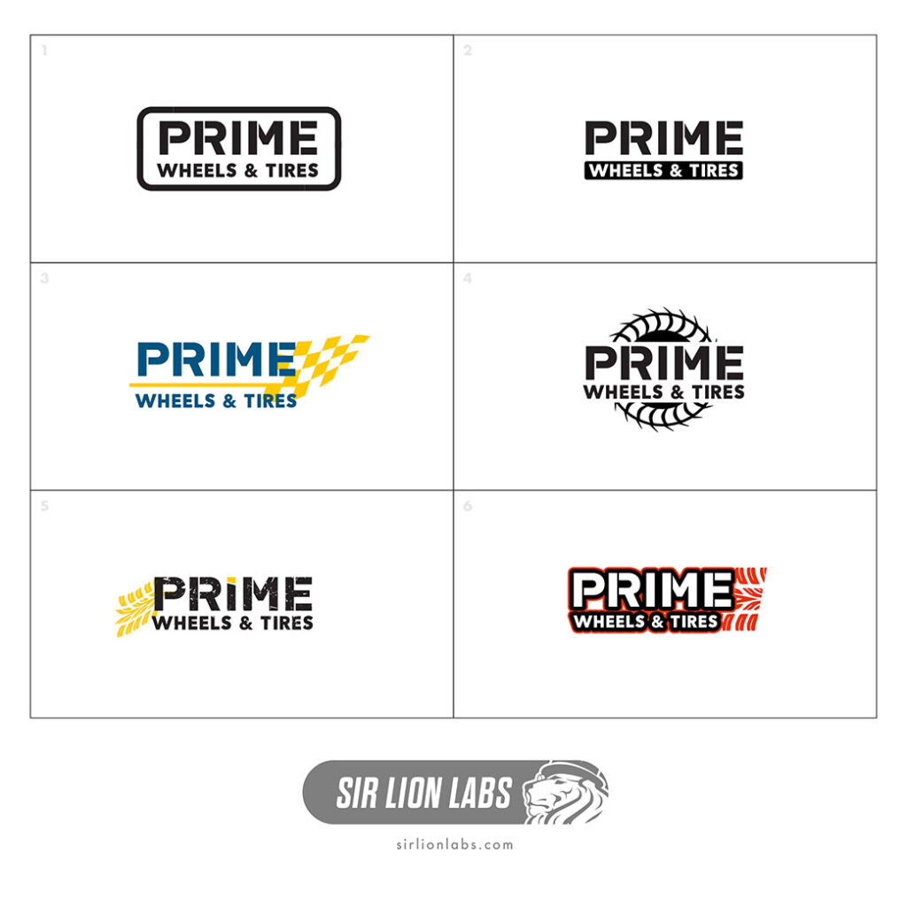
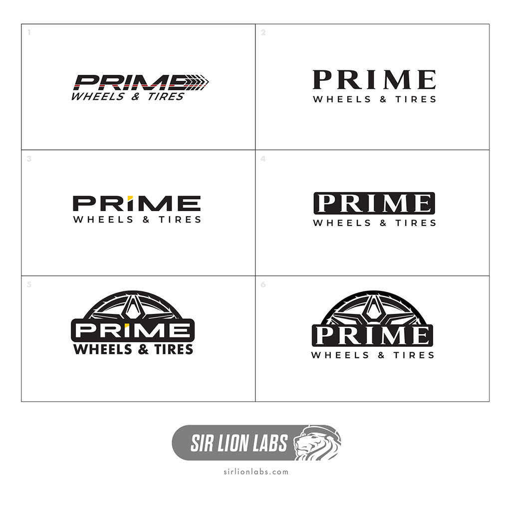
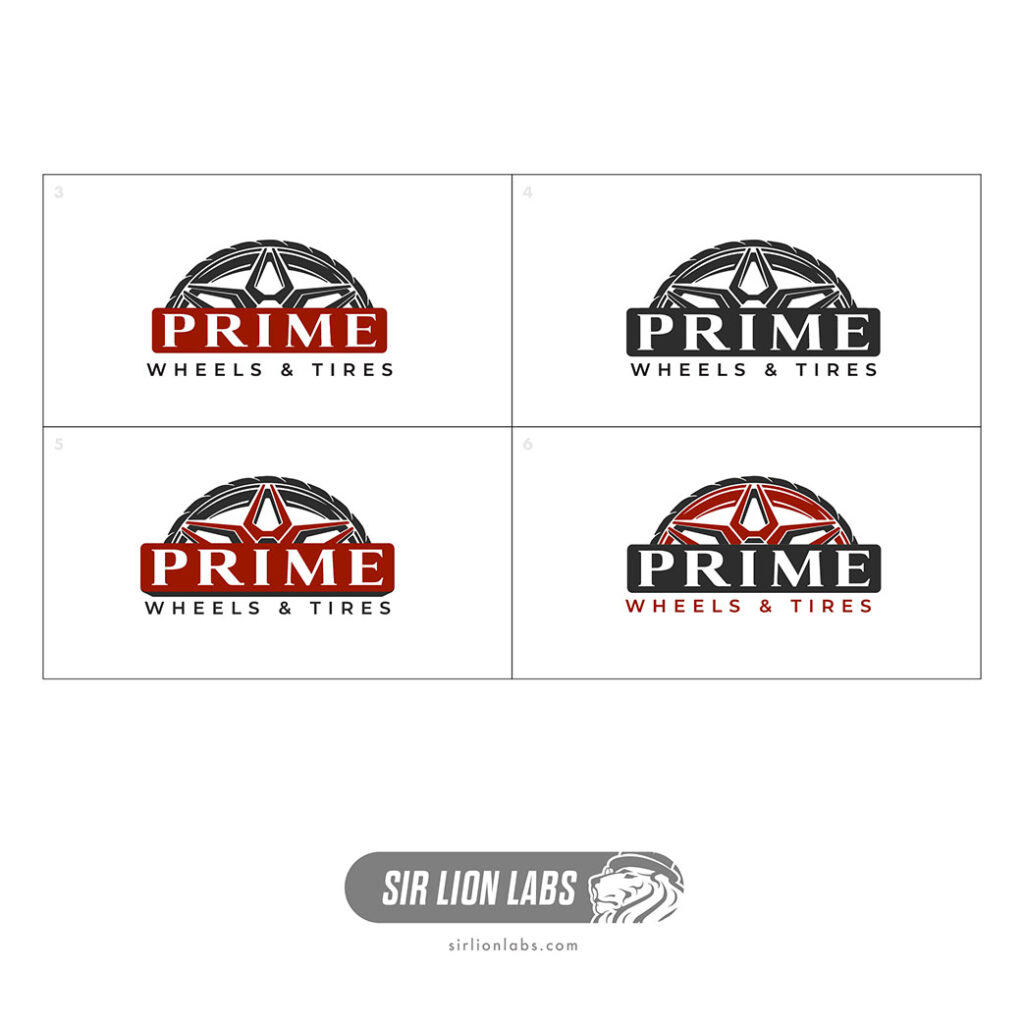
After the initial concepts we can revise again upon what’s important and desired. Simplicity on this design is important for a couple reasons: The logo will need to be used on many types of media including digital and social media, print for business cards, and even physical for cutting vinyl decals for vehicles. We narrowed down to two styles with some individual variants and optional iconography and finally a few color options. The two-color flat design was chosen for simplicity with regard to cutting vinyl decals. The final steps include some fine-tuning of the wheel and tire shapes to make sure everything is symmetrical and the vector line-work is all cleaned up for production.

 S2000 Wrap Design