Last year, we worked with Cargo Express Freight to build them a brand new website. They recently came to us with a desire to update their branding to a fresh new look for 2018!
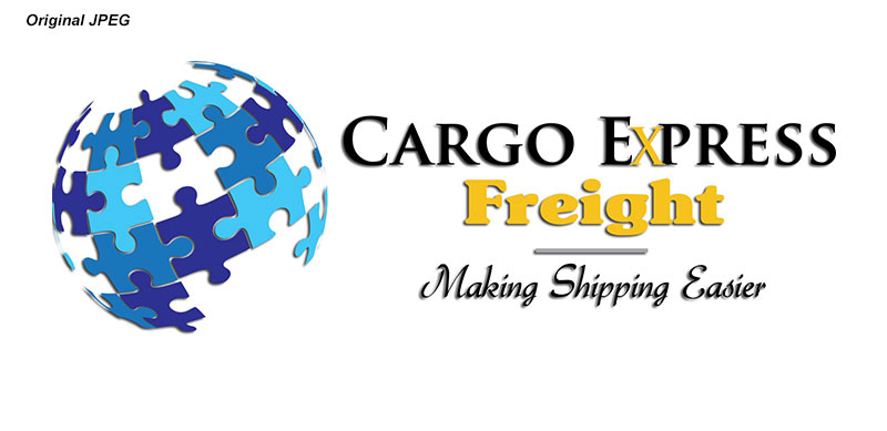
A logo says a lot about company. It establishes brand equity and recognition, but most importantly it captures first impressions. A company that spends time on their own brand image is one that spends time on the details; details matter! A quality brand starts with a quality logo. Take a look at their old logo and we’ll dive in to how we came up with some new designs for their logistics company!
Concepts From Scratch
When working on a new logo, Sir Lion Labs will start by sketching out some concepts on paper to get some rough ideas. Then, we will input them into the computer and create a layout of a few different styles which might spark interest for the client’s new look. Some concepts resemble the old branding with the puzzle globe while others move in a completely different direction. Having just built them a brand new website, we aimed to create a new logo with respect to their new online presence.
We first work our concepts in black and white for a few different reasons. One reason being that a strong logo should be strong without influence of color; another reason being that a logo must not rely on color to be effective! Sometimes media is only offered in black and white!
![]()
Concept revisions and Feedback
Once we create a few new concepts and send to our client, we take in their feedback. They tell us what appeals to them, what they like, what they don’t like and make necessary revisions to refine the new logo even more.
Our client chose logo 4 from above and we worked some revisions based on their feedback. They liked the style but wanted to see options with arrows in different places, text being positioned differently, as well as the logo being styled with various breaks in the line work. Take a look at how different each logo looks even though it was based on one single design! Once the client finds a style they like, we move on to color variations.
![]()
Adding Color
Once a black and white logo is created, we start adding color. We already created a color palette when we built their brand new website so we ran with some similar variations including different shades which would be easily translatable to the website if they decided to change things up.
We provide unique color options for each logo. Sometimes obvious color options don’t quite work but we provide them to help the client decide on the best option for them. Sometimes it takes seeing an example not work to make the right decision.
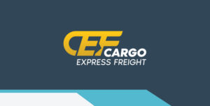
Although yellows can be hard to read from afar, especially when on white backgrounds such as truck trailers, we chose to use a darker golden-yellow with a slightly darker gold drop shadow to help increase contrast for applications like this. We also provided inverted versions for when the logo might appear on dark colored backgrounds.
![]()
The End Result
After plenty of discussion, notes, revisions, and changes, we came up with a fresh new logo for Cargo Express Freight. We are excited for their new look and are looking forward to updated their truck graphics, office signage, business cards, and more!
If you’d like to explore a fresh new look for your brand, please contact is to start a discussion using the form below. We’re exited to hear from you!

 We convert logo JPEG’s into vector format